

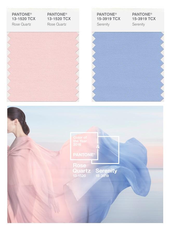
Calm combo: Design experts on color of the year Rose Quartz and Serenity
As if to say “it don’t matter if you’re black or white,” the Pantone Color Institute has combined two hues for its Color of the Year—a first in the Institute’s 16 years of predicting the shade that will dominate in different design industries across the globe.
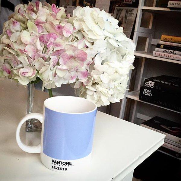
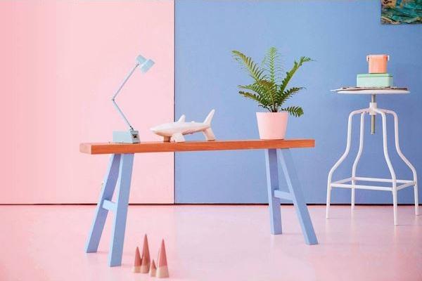
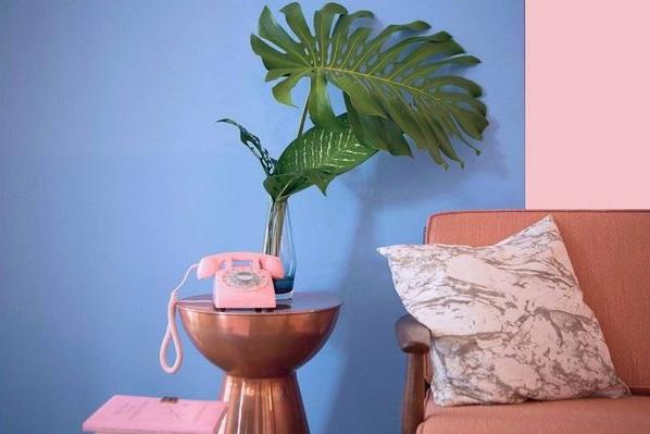
The Color of the Year for 2016 is Rose Quartz and Serenity, a harmonious combination of pastel hues—Pantone 13-1520 and Pantone 15-3919, to be exact— that “demonstrate an inherent balance between a warmer embracing rose tone and the cooler tranquil blue, reflecting connection and wellness as well as a soothing sense of order and peace.”
GMA News Online interviewed four local interior designers and visual artists individually to get their take on Pantone’s decision and what it means for the design world.
A symbolic choice
Preceded by other radical developments in pop culture and the media such as Marvel’s female Thor and the Pirelli calendar featuring powerful, iconic women (most of them fully clothed), Pantone’s choice to name two colors of the year instead of just one came at exactly the right time.
“We are entering an era similar to the onset of the Industrial Revolution. During the last quarter of 2015, we have seen a lot of advancement in technology, medical research, economy in general. People are also more conscious now of our role to take care of the environment. The earth is generally peaceful and people are going back to the old ways of slow, stress-free living,” said Aaron Paglicawan, managing partner of interior design and visual merchandising firm Detalye Design Group.
Have you downloaded the free #Pantone Effects yet? The filters are inspired by the #ColoroftheYear 2016 @Aviary pic.twitter.com/phnrnfWqXA
— PANTONE (@pantone) January 20, 2016
Paglicawan said that at first, he thought the colors of the new Color of the Year were "a bit dull" and a drastic change from 2015's Color of the Year, Marsala. "But after a while, I realized Pantone seems to be trying to make a statement," he said. "With such a chaotic environment we are in, I think Pantone is trying to calm things a bit with this choice of colors. Rose Quartz and Serenity, for me, depicts humility, peace and equality."
A much-needed calm
Newly licensed interior designer Sasa Rodriguez thinks the new Color of the Year is a shift in the opposite direction from last year’s deep, earthy hue. Compared to the rich, bold Marsala of 2015, Serenity and Rose Quartz are muted and delicate.
“I think Rose Quartz gives off a positive vibe and Serenity reminds you to take it easy once in a while…Maybe they decided to go for the opposite of Marsala Red, which is strong and deep, to something more light and soft,” she said.
Rodriguez recalled seeing a show in which people in a vehicle-impounding office became calmer instead of stressed or angry when the office was painted pink from its original neutral color. "I believe color and environment affect our behavior and mood," she said.
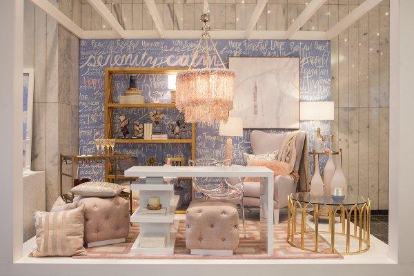
Similarly, Paglicawan pointed out that the color duo can easily be found in a nursery, but can also be used “in spaces where people stay to pray, meditate, exercise, eat consciously, read, work or just be alone and be with oneself.”
Two for the price of one
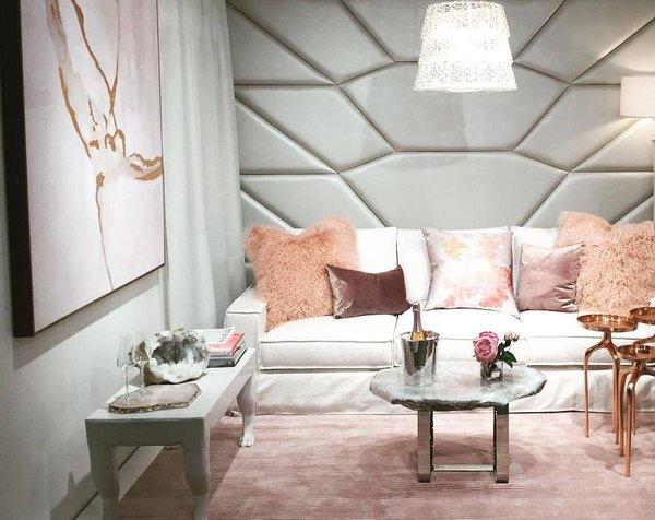
Rodriguez added that two colors means more room to play with patterns and proportions. "It could be Rose Quartz with a hint of Serenity, or vice versa. Since they're both light colors, they're easy to put together in creating patterns and combinations which are not so loud or high contrast unlike black and white," she said.
She explained that working with the two colors poses “a challenge to explore and be creative… [in choosing to] use them individually or as a pair… without overdoing it.”
Paglicawan also noted that the two go well together, especially when combined “through a line or an ombre-like effect.”
“Subtlety is a characteristic of this color, so overdoing is impossible,” he continued, adding that he’s excited to see both colors on “technically everything under the sun.”
Muted
For visual artist Nice Buenaventura, however, the colors are a little too subtle.
“I'm not in love with either. They're a bit too muted for my liking," she said.
"But I love the idea that Pantone decided to pick two colors of the year at once. I especially like that they present the pair as a gradient...I think the decision is a well-justified departure, and it's evidence that the art and design world is responsive to global issues and societal trends—most notably the great gender blur.”
The official colors of 2016 could help redefine gender via @Techinsider https://t.co/VdqAQL8Mgh pic.twitter.com/suq0MHnwKg
— PANTONE (@pantone) December 4, 2015
Gender fluidity and the need for calm- talking about the Colour Of The Year 2016 @pantone x @wgsn event now pic.twitter.com/rlpmNNHFNR
— WGSN (@wgsn) December 10, 2015
Pantone’s new #ColoroftheYear is a nod to gender equality via @QZ https://t.co/f0SfjHixnz pic.twitter.com/Lwoc3IojkW
— PANTONE (@pantone) December 4, 2015
"If one must use the color pair, I'd suggest taking advantage of its subtlety by applying either color as a canvas or base layer. Then, combine it with vivid accent colors for that much needed contrast," she advised.
Just a guide
Pojie Pambid, Dean of the Philippine School of Interior Design, said that he is not a fan of pastels, whether in his work or on a personal level.
However, he said, "Pantone’s colors of the year are both pretty and they evoke a certain pastel vibe which a lot of people can relate to."
"Pantone’s choices in the past have been very varied and will work depending on… the type of project and the theme," continued Pambid.
His biggest tip for fellow designers, artists and hobbyists is to “figure out the function of the space first.”
"I think it’s cool that for the first time we have two to choose from. They’re quite easy on the eyes… [but] both a bit feminine for my taste. Personally, I still think that it all boils down to personal preferences," said Pambid.
"When working on a project, I base my color choices on the theme, function, and mood of the space and also how big the space is."
For Rodriguez, who graduated from Pambid’s class last year, “choosing a color goes beyond which is the favorite, and preference for it can be used to symbolize an idea or an image and affect us emotionally and psychologically.”
She added that “making Pantone's color of the year a part of your year doesn't really have to be limited to or as big as renovating your rooms or condominium units.”
Her tips to try out the combo include little things like “getting your nails painted, DIY projects… and crafts, decorating your home with flowers, or even… [purchasing] electronics and accessories.”
If there’s anything all four design professionals agree on, it’s that the choice to have two colors instead of just one was a good one. Much like the cotton candy hues that have painted the Philippine skies these past few weeks, Rose Quartz and Serenity promise a year of endless possibilities in exploration, chances to break away from the norm, and an overwhelming sense of harmony and peace. — BM, GMA News
